
A note for developers: GanttChartView and other components from both Gantt Chart Hyper Library and Gantt Chart Web Library change the way they look if you rely on default settings for their appearance (once you update to the new builds that we’ve just released – 5.3.20 in both cases).
Why updating defaults?
We needed to modernize the look and feel of the components in new projects without requiring developers to apply special user interface themes, to make them work better by default, considering nowadays end users’ expectancies.
What changes, exactly?
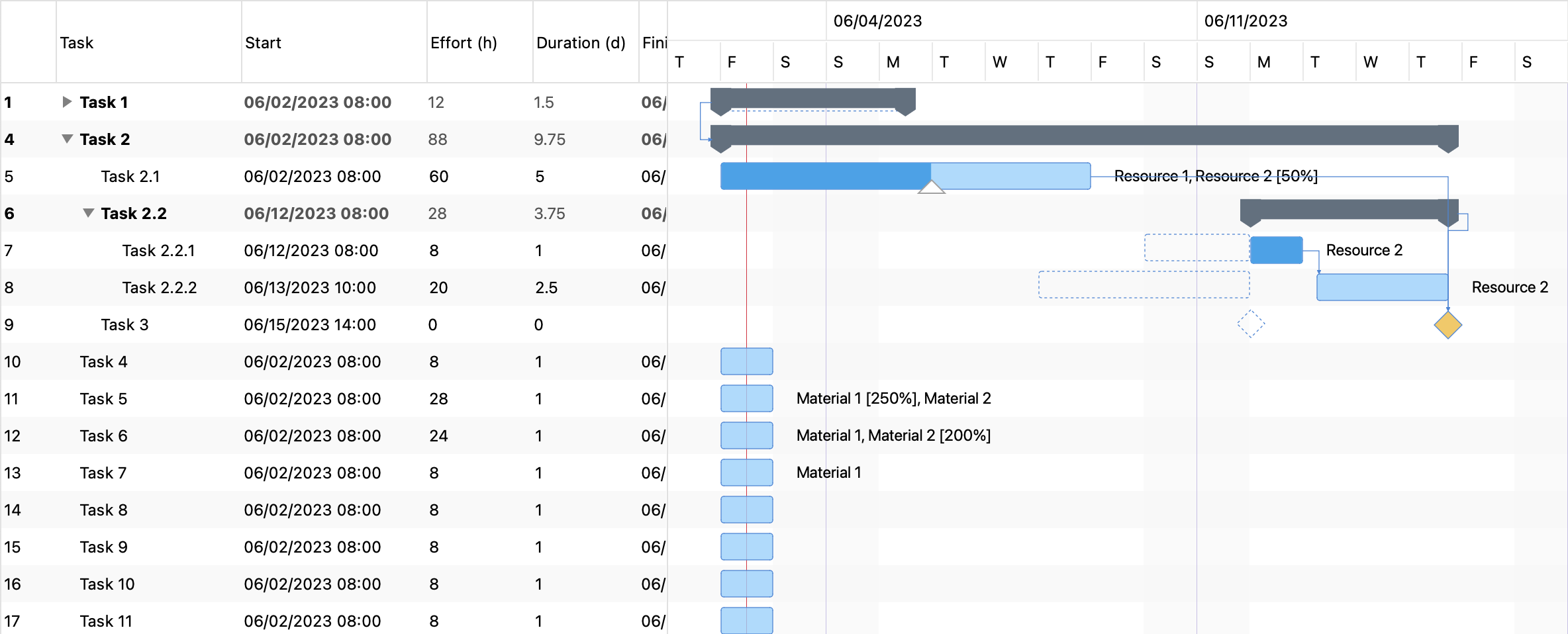
The Gantt chart item rows have higher heights by default, the chart bars are larger as well, and upon hovering (or touching) a standard task bar a triangular thumb allows the end user to easily change the item’s completion. Dependency pointer thumbs also appear a bit distanced from the chart bars now, to allow the end user to more easily update start and finish times, while preserving the ability to create dependencies between items using mouse dragging or touch spite operations.
The colors of the bars and milestone diamond shapes are also different by default, and chart zoom level is increased, while alternative items are now a bit highlighted by design, too.
Finally, the grid header will always display vertical column separators and some further padding will apply to all header and grid cells.
How to revert?
On JavaScript side, everything will continue to work as before, even if you update the library to the new version, if you simply add this line of code before initializing components:
settings.classic = true;On ASP .NET the trick will be similar:
GanttChartView.Classic = true;However, if you also use themes.js in an ASP .NET project, you’d need to also get an updated version of that file, e.g. from our Main features sample app.
 DlhSoft Team's Blog